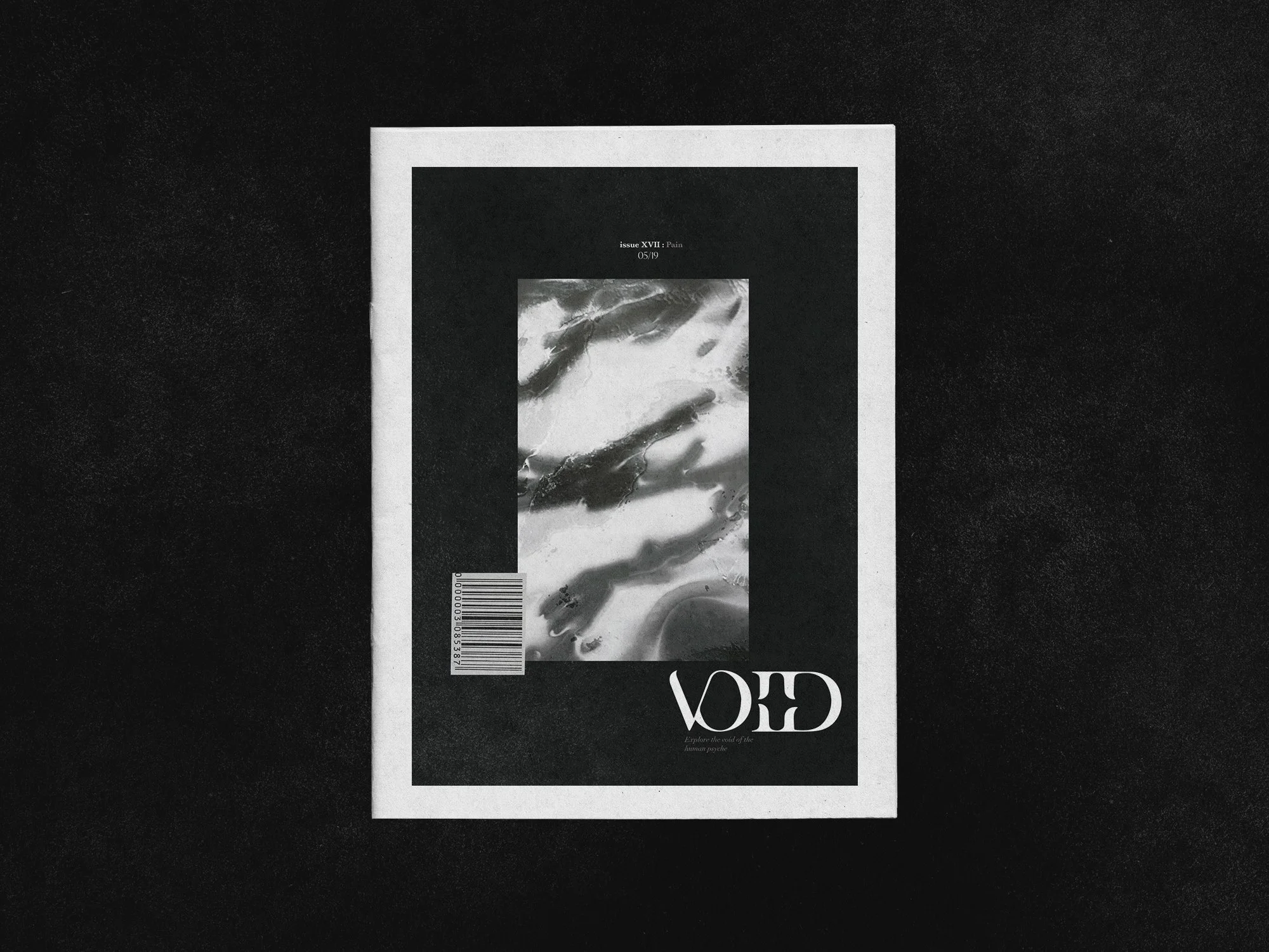
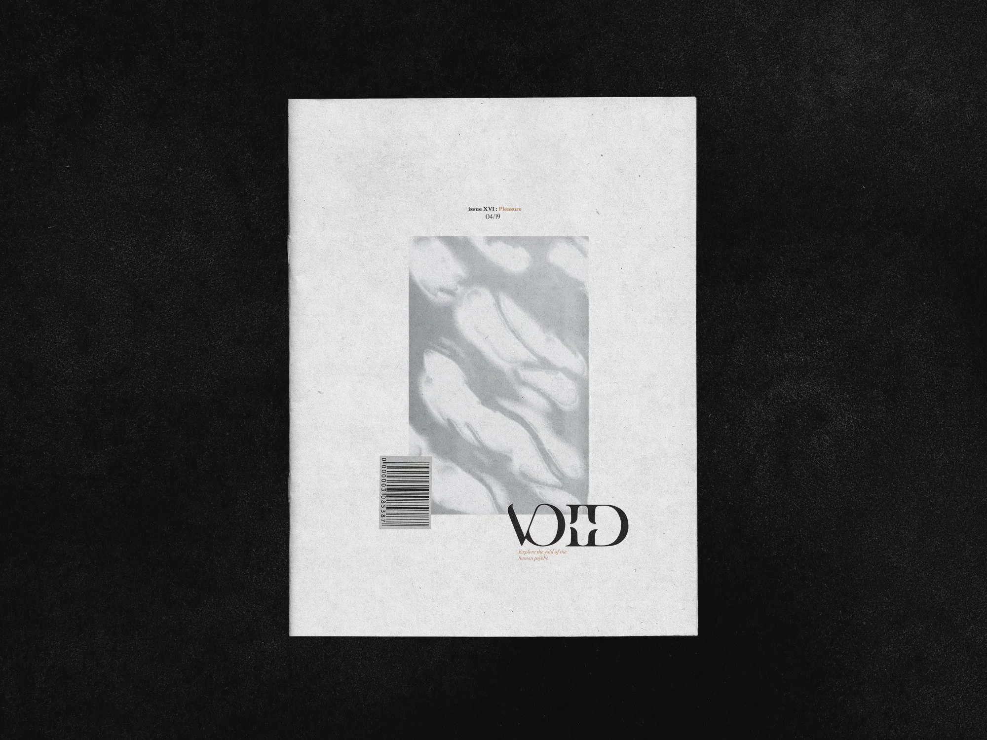
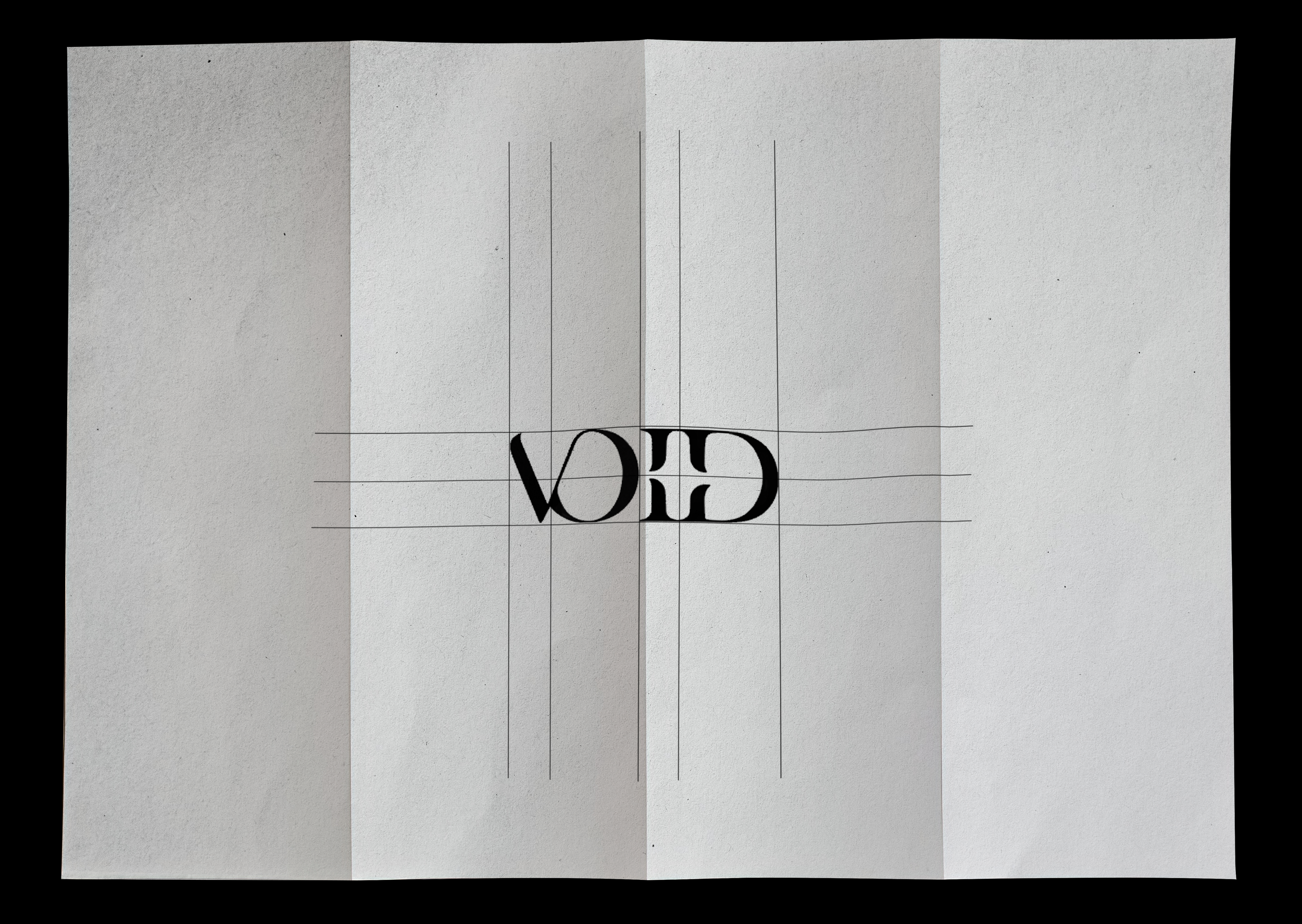
VOID
A quarterly dropping magazine, tête-bêche binding
The logo is built from a high-contrast serif typeface, At the center of the mark, the relationship between the “I” and the “D” becomes structural and symbolic. The spacing between them creates a deliberate pause—an axis that reflects duality. This tension mirrors the magazine’s double-sided format and its exploration of the human psyche—pleasure and pain, restraint and indulgence—cut from the same cloth, yet inherently distinct. using imagery only from nature and creating nature motifs.

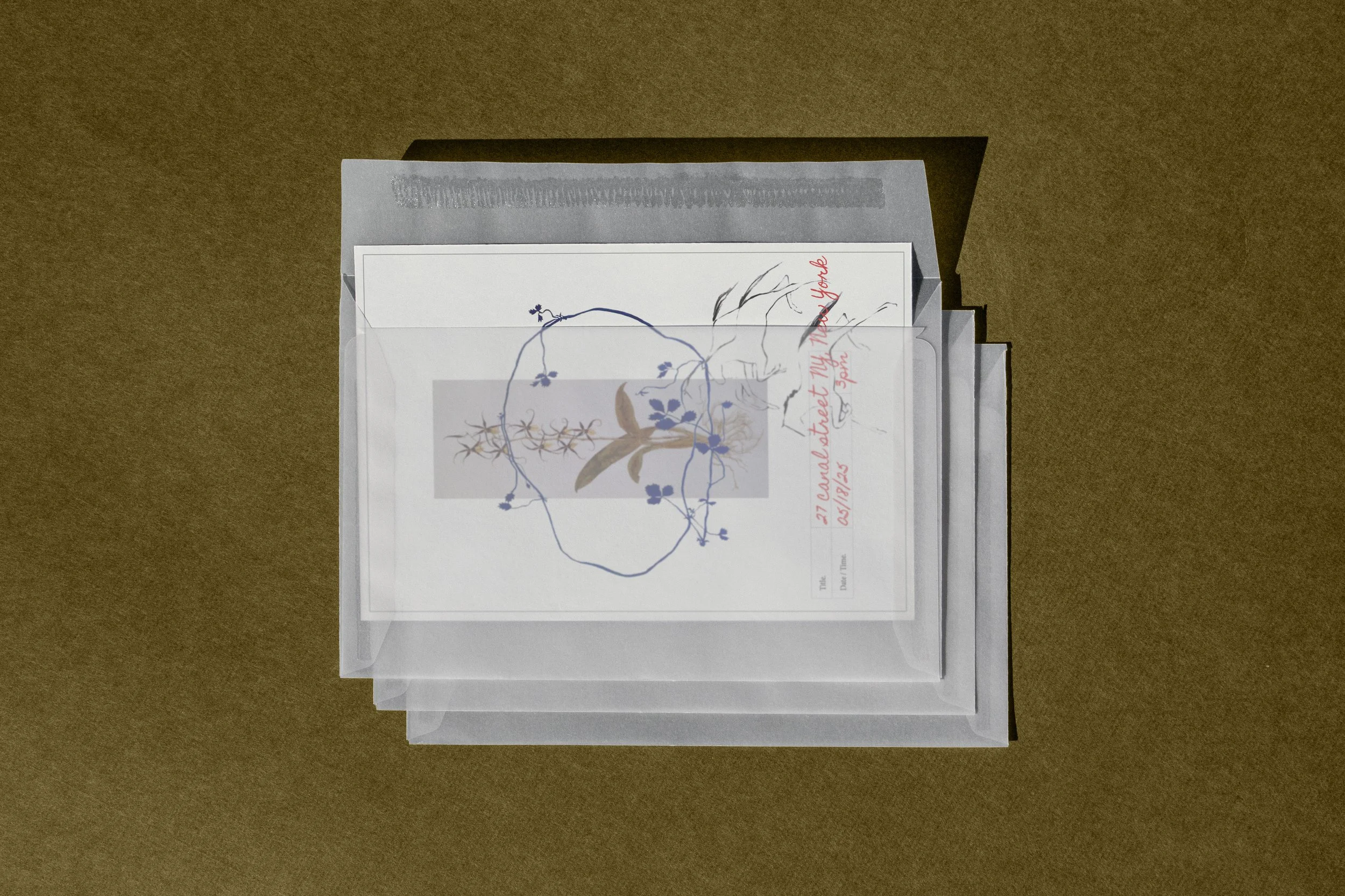
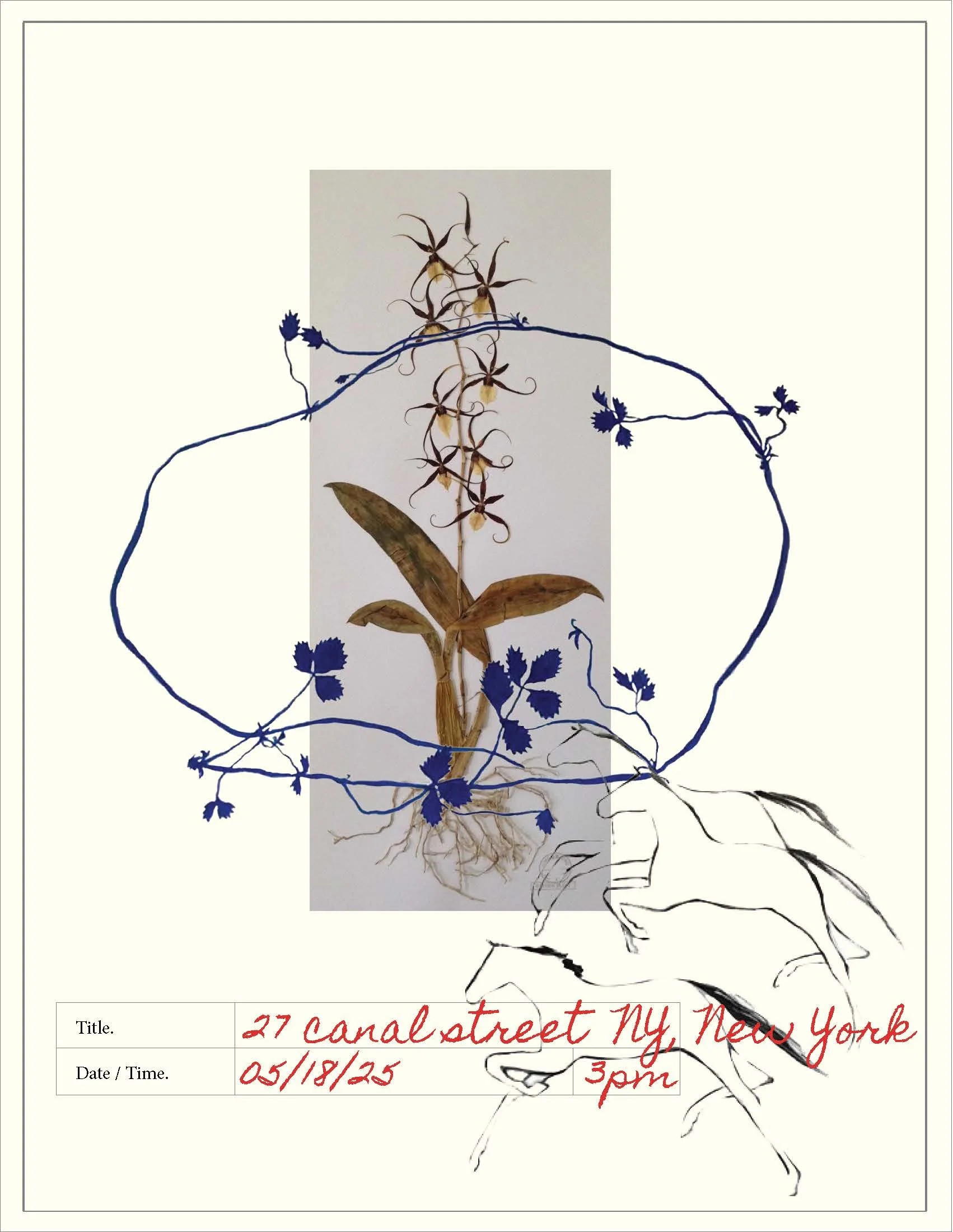
28th Birthday Invitation
Collaging and mixed media